
100 Things Every Designer Needs to Know About People
by Susan Weinschenk
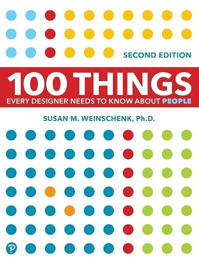
The 60-Second Take
In 100 Things Every Designer Needs to Know About People, behavioral psychologist Susan Weinschenk bridges the gap between brain science and user experience. She outlines the neurological realities of how users see, read, remember, and decide. By understanding human limitations—from our fragile working memory to our unconscious decision-making—designers can build intuitive, friction-free interfaces that motivate action rather than causing cognitive overload.
Good Design Is Just Applied Psychology
When you build a digital platform, it is tempting to view your users as logical, highly attentive computers. You assume that if you provide all the right information in a clean layout, they will read every word, weigh the evidence, and make a rational choice to click, subscribe, or hire you.
Susan Weinschenk has spent her career proving that this assumption is entirely backward. In 100 Things Every Designer Needs to Know About People, she argues that users are evolved primates operating on limited cognitive batteries. They are easily distracted, quick to forget, and driven by unconscious impulses. Weinschenk, a behavioral psychologist, takes decades of research in neuroscience and psychology and translates it into practical rules for design.
Whether you are laying out a physical product, configuring a complex software interface, or putting together a consulting website on Squarespace, aesthetics alone will not save you. You have to understand how the human brain actually processes information. This summary distills Weinschenk’s extensive list into the core psychological principles that dictate how people interact with design.
What You'll Learn
Why the famous "seven plus or minus two" memory rule is a myth
How peripheral vision secretly controls where your users focus
Why dopamine makes users crave information but lose focus
How to use progressive disclosure to handle complex information
Why unconscious decision-making drives most user actions
How People See and Read
The most fundamental mistake designers make is misunderstanding how human vision works. We think of our eyes as video cameras capturing a full, detailed scene. In reality, vision is a highly selective construction project managed by the brain.
Weinschenk highlights the outsized role of peripheral vision. While our central foveal vision is sharp and focuses on the exact text or object we are looking at, our peripheral vision is actually running the show. It scans the edges of the screen to decide where our central vision should dart next. If the periphery of your website is cluttered or filled with flashing elements, the user's brain will constantly drag their attention away from your core message.
Furthermore, humans are biologically hardwired to notice faces. A specific part of the brain called the fusiform face area bypasses normal visual processing channels to identify faces instantly. You can use this to your advantage. If you place a photo of a person looking directly at the user, it builds an emotional connection. Better yet, if you place a photo of a person looking toward your contact form or call-to-action button, the user's eyes will automatically follow the model's gaze.
Reading is equally misunderstood. People rarely read digital text letter by letter or even word by word. They recognize the shapes of familiar words and scan for visual patterns. This is why large blocks of unbroken text are instantly ignored. To get people to read, you must break the text into small chunks, use descriptive subheadings, and rely on bullet points to create recognizable visual patterns that the brain can digest quickly.
The Fragility of Working Memory
For decades, designers and psychologists cited George Miller's famous 1956 paper claiming that human working memory could hold "seven plus or minus two" items at a time. Weinschenk points out that modern research has thoroughly debunked this. The actual limit of working memory is closer to three or four items.
Working memory is incredibly fragile. If a user is holding three pieces of information in their mind—say, the price of a service, a specific feature, and the location of the checkout button—and they are suddenly distracted by a pop-up window, that information is wiped out. They have to start their cognitive process over from scratch.
To design around this limitation, you have to use a technique called chunking. If you present a user with ten distinct choices, they will feel overwhelmed. But if you group those ten choices into three distinct categories, the brain only has to process the three categories. This applies to phone numbers, credit card fields, and especially navigation menus. You should never force a user to hold more than four distinct items in their working memory at any given moment.
Progressive Disclosure and Cognitive Load
Every time a user has to figure out how your interface works, read a complex sentence, or decide which button to click, they burn cognitive energy. When the cognitive load becomes too high, they simply abandon the task.
Weinschenk heavily advocates for a principle called progressive disclosure to manage this load. Progressive disclosure means giving the user exactly the information they need at that specific moment, and nothing more, while providing a clear path to access deeper details if they want them.
Imagine you are building a platform to showcase a deep background in finance and strategic advisory. The instinct is often to put your entire resume, your underlying methodologies, and detailed case studies right on the homepage to prove your authority. This creates a massive cognitive load for the visitor.
A much more effective approach is to use progressive disclosure. You might offer a concise, punchy homepage blurb that establishes credibility, followed by horizontal scrollable career cards. These cards provide just enough of a summary to pique interest. If the user wants to know more about a specific role or financial strategy, they can click to expand that specific card. You are still providing all the complex information, but you are letting the user pull it out at their own pace rather than pushing it all onto them at once.
Motivation and the Dopamine Loop
If you want users to take action, you have to understand the neurochemistry of motivation. Weinschenk clarifies a common misunderstanding about dopamine. People often think dopamine is the brain's "pleasure" chemical. In reality, it is the brain's seeking chemical.
Dopamine is released when we are anticipating a reward, driving us to seek out information. The internet is essentially a giant dopamine engine. The constant availability of small bits of information—a new email, a text message, a social media notification—keeps users trapped in a seeking loop. You can utilize this by offering small, unpredictable rewards throughout your user experience to keep people engaged.
You can also leverage the endowed progress effect. People are much more motivated to complete a task if they feel they have already made progress toward it. If you have a multi-step onboarding process or a detailed client intake form, do not start them at zero. If the first step is simply clicking the link to open the form, show them a progress bar that is already ten percent filled. That artificial head start significantly increases the likelihood that they will finish the task.
People Make Mistakes: Design for Forgiveness
Humans are distracted, tired, and prone to error. They will click the wrong button. They will accidentally delete their data. They will format their phone number incorrectly in your form.
Weinschenk insists that a good designer anticipates these failures and designs for forgiveness. When a user makes an error, the system should not scold them or fail silently. Error messages should be clear, written in plain language, and tell the user exactly how to fix the problem without making them feel stupid.
Better yet, prevent the error from happening in the first place. Use constraints. If a field requires a date, provide a calendar dropdown rather than an open text box. If an action is destructive and permanent, force a confirmation dialogue. The system should absorb the complexity so the user does not have to.
The Psychology of Design at a Glance
Peripheral vision leads. People use their peripheral vision to decide where their central vision should focus next. Keep the edges clean.
Faces demand attention. The brain is hardwired to look at faces, and users will instinctively follow the eye-gaze of a person in a photograph.
Memory is tiny. Working memory holds about four items, not seven. Always group information into smaller chunks.
Dopamine drives seeking. Anticipation of information keeps people clicking.
Decisions are unconscious. Most choices are made emotionally and unconsciously first, then rationalized logically later.
A Quick Start Guide to Designing for the Brain
Ruthlessly chunk your information. Never present a user with a wall of text or a dozen loose options. Group them into distinct, manageable categories.
Implement progressive disclosure. Give users a high-level overview first. Let them click or scroll to reveal the heavier details only when they are ready for them.
Check your eye-gaze. If you use photos of people, ensure they are looking toward your most important content, not away from it.
Assume users will scan. Write your copy for the scanning eye. Use short paragraphs, bold keywords, and bullet points.
Design for forgiveness. Build interfaces that expect users to make mistakes. Make it incredibly easy to undo an action.
Who Should Read 100 Things Every Designer Needs to Know About People (and Who Can Skip It)
Read it if you are building a website, app, or physical product and want a science-backed understanding of why users behave the way they do.
Read it if you are a marketer or copywriter looking to reduce friction in your conversion funnels.
Read it if you lack a formal background in behavioral psychology but need a highly accessible, practical cheat sheet of human behavior.
Skip it if you are looking for specific tutorials on color theory, typography, or how to use design software. This is a book about brain science, not aesthetics.
Skip it if you already have a deep, academic background in cognitive psychology. The concepts here are introductory and highly distilled for practical application.
Final Reflections
100 Things Every Designer Needs to Know About People is an indispensable reference manual for anyone who creates things for other humans to use. Weinschenk successfully strips away the academic jargon of neuroscience and delivers actionable, bite-sized lessons. Its greatest strength is its relentless focus on the biological realities of the user. We design for the people we wish existed—attentive, logical, and patient. Weinschenk forces us to design for the people who actually exist. While the rapid-fire, 100-chapter format can occasionally feel disjointed, it makes the book exceptionally easy to pick up, reference, and immediately apply to whatever interface you are building today.
The Bottom Line
Stop designing interfaces based on what looks visually impressive and start designing them around the severe biological limits of human memory, attention, and perception.
Frequently Asked Questions
What is the main idea of 100 Things Every Designer Needs to Know About People? The core idea is that effective design must be rooted in behavioral psychology and neuroscience. By understanding how the human brain actually processes visual information, remembers data, and makes decisions, designers can create interfaces that work with human nature rather than fighting against it.
Does the book only apply to web design? No. While many examples focus on digital interfaces and websites, the psychological principles apply to physical product design, marketing materials, presentation slides, and any scenario where a human must interact with a system or information.
Is the book too technical to understand? Not at all. Weinschenk specifically wrote it to be a practical guide rather than an academic textbook. Each of the 100 concepts is presented in a short, easily digestible chapter with clear takeaways that you can apply immediately.
Business Floss is reader-supported. When you use our links we may earn an affiliate commission that helps us keep the site running. Thank you for your support!


