
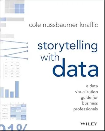
Storytelling With Data
A Data Visualization Guide for Business Professionals
by Cole Nussbaumer Knaflic
The 60-Second Take
In Storytelling with Data, Cole Nussbaumer Knaflic teaches business professionals how to turn dull spreadsheets into clear, persuasive visuals. Through six practical lessons, she shows how to choose the right chart, strip away clutter, use color to direct attention, and wrap the numbers in a narrative. The goal is not prettier graphs but communication that drives genuine understanding and action.
Storytelling with Data: Turn Numbers Into a Story People Act On
We have all sat through a presentation drowning in dense, cluttered charts, squinting at a slide jammed with numbers while the presenter promises it all makes sense. Finance and business professionals live in this world, building reports and dashboards that often fail to land. Cole Nussbaumer Knaflic, who honed her craft on the people analytics team at Google, argues that the problem is rarely the data itself. It is how we choose to show it.
Storytelling with Data is a practical guide to communicating with numbers. It is not about making graphs look pretty for their own sake. It is about using a handful of design principles so that your audience instantly grasps the point and knows what to do about it. This summary covers the six core lessons and how to put them to work in your next report or presentation.
What You'll Learn
Why context matters more than the chart you reach for first
How to pick the right visual for the message you want to send
How to declutter so the signal is not lost in the noise
How to use color and placement to direct your audience's attention
How to wrap your data in a narrative that drives action
Start With Context, Not the Chart
Knaflic's first lesson is that most people build a visual before they understand what they are trying to say. Before opening a charting tool, you need to be clear on three things: who your audience is, what you need them to know or do, and what data best supports that message. The work starts with the point, not the picture.
The sharpest version of this is what she calls the so-what test. Every chart should make a specific point, not just present information and leave the audience to figure it out. If you cannot state in one sentence what a slide is supposed to communicate, the slide is not ready. For a finance professional presenting results, this means leading with the takeaway, not the table.
Choose the Right Visual
Much of the book is a tour of when to use which type of chart, and which to avoid. Knaflic favors a small, reliable toolkit. Simple text works best when you have just one or two numbers to convey, since a single bold figure often beats a graph. A well-built bar chart is the workhorse for comparing categories because our eyes judge length easily. A line chart is ideal for showing change over time.
Just as important is what to avoid. She is famously skeptical of pie charts, which force the eye to compare angles and areas it cannot judge accurately, and she warns against three-dimensional effects and decorative flourishes that distort the data. The principle is to choose the visual that makes the comparison effortless for the reader, not the one that looks impressive.
Data Visualization Lessons at a Glance
Understand the context. Know your audience, your message, and the action you want before you chart anything.
Choose an effective visual. Match the chart to the message. Favor simple text, bars, and lines, and avoid pie charts and 3D.
Eliminate clutter. Remove every element that does not add value. Each one raises the effort the reader must spend.
Focus attention. Use color, size, and position deliberately to guide the eye to what matters.
Tell a story. Give your data a beginning, a tension, and a resolution so it persuades rather than merely informs.
Declutter Until Only the Signal Remains
A central idea is cognitive load, the mental effort it takes to process a visual. Every gridline, heavy border, redundant label, and background shade adds load without adding meaning. Knaflic draws on Gestalt principles of visual perception to explain how the eye naturally groups and reads elements, then uses them to justify stripping a chart down.
The practical move is to question every single element on the page and delete anything that does not earn its place. Lighten or remove gridlines, drop unnecessary borders, label directly rather than relying on busy legends, and let white space breathe. A decluttered chart does not just look cleaner. It is genuinely faster and easier to understand, which is the whole point.
Focus Attention and Tell a Story
Once the clutter is gone, you can direct the audience's eye on purpose. Knaflic explains preattentive attributes, the visual cues like color, size, and position that the brain processes almost instantly, before conscious thought. A single bar colored while the rest stay gray pulls the eye straight to the number you care about. Used sparingly, color becomes a spotlight rather than decoration.
The final lesson ties it all together: tell a story. Borrowing from narrative structure, she encourages presenters to set up the context, introduce the tension or problem the data reveals, and resolve it with a clear recommendation. Numbers arranged as a story are remembered and acted upon. Numbers dumped as a table are forgotten. The data becomes persuasive only when it carries a narrative.
A Quick Start Guide to Better Data Communication
Write the takeaway first. State the one sentence your chart needs to prove before you build it.
Pick the simplest visual. Use text for a single number, bars for comparisons, and lines for trends over time.
Delete the clutter. Strip gridlines, borders, and stray labels until only the meaningful ink remains.
Spotlight with color. Gray out the context and use one accent color to point to what matters.
Frame it as a story. Lead with context, reveal the tension in the data, and close with a clear recommendation.
Final Reflections
Storytelling with Data has become a modern standard for a reason. It treats data communication as a learnable skill rather than an innate talent, and it gives you concrete, repeatable rules instead of vague advice to keep things simple. The deeper message is that a chart is not a place to store information. It is a tool to make a point and prompt a decision. For anyone in finance, analytics, consulting, or management who regularly presents numbers, mastering these six lessons will make your work clearer, more credible, and far more persuasive. It is the rare skill that pays off in every report you ever build.
In a Nutshell
In Storytelling with Data, Cole Nussbaumer Knaflic teaches business professionals how to turn dull spreadsheets into clear, persuasive visuals. Through six practical lessons, she shows how to choose the right chart, strip away clutter, use color to direct attention, and wrap the numbers in a narrative. The goal is not prettier graphs but communication that drives genuine understanding and action.
Business Floss is reader-supported. When you use our links we may earn an affiliate commission that helps us keep the site running. Thank you for your support!


